ThE rEaSoN I aM sTaRtInG tHiS bLoG iN sUcH a MaNnEr Is To InDiCaTe ThE sIgNiFiCaNcE oF vIsUaLiZaTiOn.
My apologies if reading the above line has irritated you and thanks for continuing to read this blog.
Significance of Proper Presentation
If you were irritated while reading the above line, then just imagine how learners or readers might feel if they see an unorganizaed presentation or a course. Of course, you will not write any course, article, or a presentation with such alternating capitalization, but the point I am driving to is: “It is not only the content of your course that matters in learning, but the way it is presented also matters”.
A heap of marble and gem stones lying on the bed of Yamuna river cannot be compared to Taj Mahal. Similarly, you cannot put all the content together in a PowerPoint and term it as a course. Random heaps of information are easily available on the Internet. So, if some customer is paying to take a course, then they would want to see something with structure, logic, and clear and relevant presentation. Just as you won’t pay to see a heap of marble and gems, customers would not want to pay for random information heaps. However, as you will not mind paying to see the Taj Mahal, which is made from marble and gems, your customers would also not mind paying for a course that meets its objectives.
Hence, ensure that your course look great, contains relevant content, and is enabling for the learners. So, in this blog, let’s discover some key aspects about visualization and why is it important, as an ID, to focus on enhancing the visual appeal of your courses.
Gagne Events and Visualization
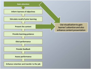
Gagne’s first Event recommends us to gain learners’ attention. The most important points that may help you achieve this are:
- Inform learners about what’s in the course for them. If you read a book, watch a movie, or play a game, then these activities must interest you or you expect to gain from these activities. Similarly, when your learners take your course, they’d expect to gain some knowledge or be able to perform new tasks. So, you need to design your restraunt’s (course’s) menu such that your target customers (learners) see what they want to eat (learn).
- Include real-life scenarios. This idea is now overkilled in the industry, so I am not detailing much about it. However, when including a scenario, ensure that the scenario is relevant and syncs with the real-life problems that your target audience face. Audience analysis is the key to designing relevant and useful scenarios. Design scenarios around problems that your audience has, which you are trying to address with your course. Just don’t have scenarios for the sake of having them.
- Use graphics, visuals, animations, and screen layouts that are relevant and appealing to your target audience group. If you are designing a course for an adult and corporate audience, have a clutter-free layout. Don’t include disney-like graphics, images, and scenario characters. Whereas, if your target audience includes school kids, disney-like characters and learning games would be “in.”
From the three attention-gaining tips mentioned above, most of us generally focus on getting the first two aspects of a course. However, if you are honest with yourself, you will realize that you don’t achieve 100% excellence in either scenario creation or what’s in a course for the learners (the first two points). The consequences of such course design are: a frustrated lead reviewer and may be a frustrated client. So, if this is the state of the aspects that we focus on the most, just imagine the level of improvement required in visualization and courses’ aesthetic design. That is, we need to focus much more on the visualization aspect of our courses.
So, where to look for information on visualization? How could you avoid your learner getting irate as you did while reading the first line of this blog? Well, as far as basic tips are concerned, don’t go anywhere except for continue reading. Here are some tips to aid your design and layout enhancements.
Long Live Microsoft Office
Microsoft Office offers the Smart Art feature with several ways to present content and information visually. The SmartArt feature offers ready-to-use visual diagrams for lists, processes, cycle, hierarchy, relationship, matrix, and pyramid. In addition, if you want to visually represent data, Microsoft Office offers easy-to-insert graphs.
Use Comics
You might have a scenario in most of your courses, but just to break the pattern of having monotonous text and graphic screens, use comic strips to convey the required information or highlight a particular tip. You don’t need to read a thesis to accept that we (human) enjoy reading comic strips. Since ages, news papers have always had sections on comic strips, which are loved by readers. So, why can’t we leverage the human affinity towards comics to aid learning?
Leverage Comparative Nature of Human Brain
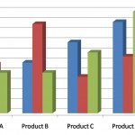
Human brain classifies and processes feelings and information based on its past experience. So, just to add an experential touch to learning, display comparative data. For example, you can use bar charts to display comparision of product sales across years. In addition, you may help learners realize their level of learning by displaying their pre-test and post-test scores.
 While using such comparative diagrams, ensure that you:
- Have comparative graphical instances next to each other
- Avoid referring to graphics and examples that are included on some other screens and have been referred to in a topic that does not align with the flow of present topic
- Use Graphic to Display Cause and Effect
- Use charts, block diagrams, or any other visualization items to display cause and effect as it aids visual recall of the cause and effect relationship.
Use Adobe Flash
Adobe Flash is an excellent tool to design and create graphics and interactions based on your requirements. However, you must have thorough knowledge of Adobe Flash as it is a fairly complex tool. Most organizations have flash experts who excel in flash interaction development.
Closing Notes
Visualization is a vast topic that can’t be summarized in one blog. I will continue to add to this post or create a new post when I learn more about visualization. However, for the present moment, when visualizing information, ensure that your graphics and layouts are:
- Not cluttered
- Not redundant
- Add value to learning
- Aid retention and recall
- Not too demanding to create
- Possible to create within the scope and budget of your project
- Functionally approved by you client (for flash objects)


